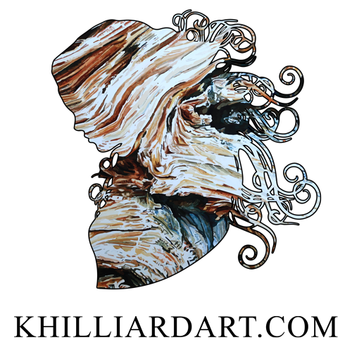
Cohesive Contrast is inspired by the colors of Joe’s Valley, Utah. While out there bouldering I noticed the sun hitting the rocks and making the sandstone appear almost white. Deep in the shadows, underneath the rock face, creating caves and caverns, laid beautiful shades of purple, blue, and orange hints accentuating the sandstone. I wanted to show the cohesion of the texture of this rock. I was fascinated by how all the stones were held in place and how the bolder curled around itself. The contrast of this piece came as I added the colors. Trying to show the light where the sun was hitting the rock and its brightness, then comparing it to the dark shadows and shades underneath, brought the word contrast to mind. This small 6 x 6 has been nonstop, layering, adding depth, detailing, then repeating the whole process over and over. I hope you all see something in this painting, as I see many faces, especially when I turn the work.


I like this piece because it can be turned in all four directions and hung for your viewing pleasure. Each direction creates a totally different composition of the work and a new focal point. For my signature, I decided to show the angle of the original photograph where the white is on top and the shadows are on the bottom. As I turn the work, I do see a shift in vision, and my new focus becomes captivated by an interesting face in the contrast of colors between orange and white. What do you see in this painting? You can contact me via Instagram, Facebook, or my Contact page on my website to tell me what you like about this piece, or anything that interests you. It is now available on my website and it is the first 6 x 6 that I have painted so it is super special. I really enjoyed creating the subtle hues, and color variance of the white sandstone. Each tiny dash and dot created a new layer of wonder for me. This is an original only, One of a Kind. I hope you all are having a wonderful weekend and getting outside! Thank you for reading.
Karen Hilliard
